
Dunkin' is the largest coffee and baked goods chain in the world and the #1 retailer of regular coffee-by-the cup in the US.
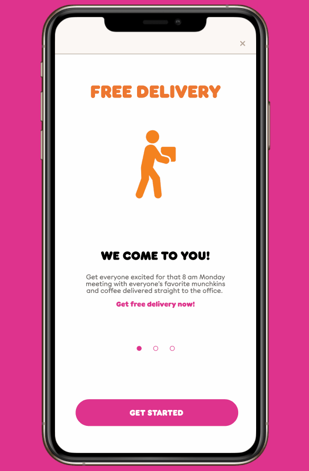
The company introduced a delivery feature in 2015 through partnership with GrubHub.
The goal of this project was to integrate an in-house delivery feature into the existing Dunkin' app.

Project Scope and Role
Project Manager + Information Architect
I worked on a three person team during a 3 week sprint for this concept project. My responsibilities included:
Managing team meetings and project timeline
Researching, analyzing and synthesizing market data into a coherent narrative
Synthesizing user interviews into representative personas
Envisioning and depicting the User journey before and after re-design
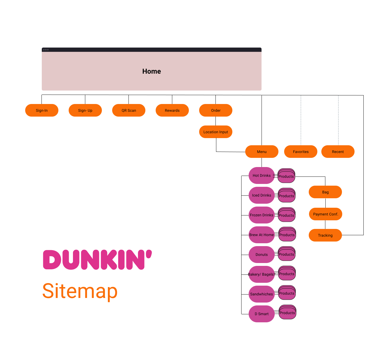
Assessing and optimizing the flow of information with site map and user flow
Designing low-fi and high-fi wireframes in keeping with the established style guide
Conducting usability testing and implementing design changes based on the findings
Market Survey
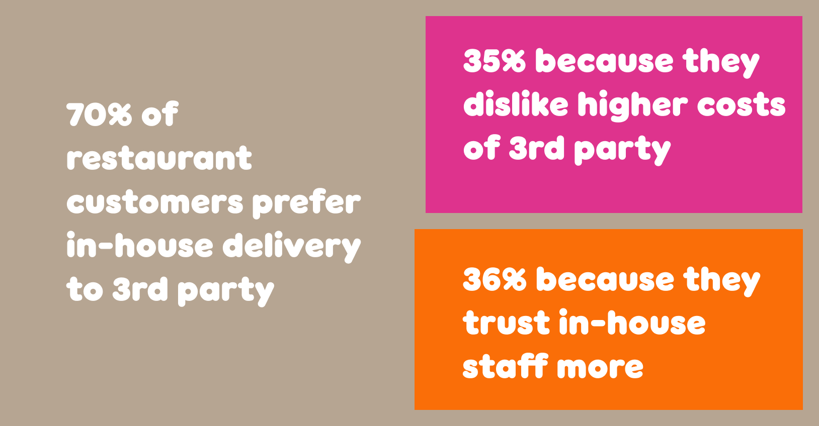
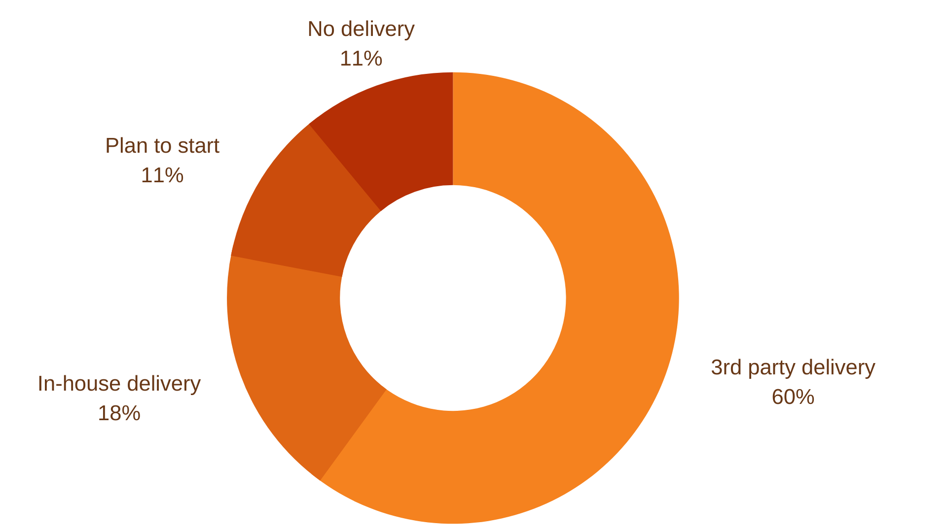
In- House Delivery Trend
I conducted a survey of research literature about restaurants and third- party delivery companies. My research confirmed that while Dunkin's 2015 partnership with GrubHub was a step in the right direction but needed to go further. The restaurant industry is embracing delivery but many, like Dunkin', are partnering with third party providers. However, customers vastly prefer in-house. Our team's goal was to keep Dunkin' runnin with a tune up to latest delivery trends.
User Interviews/Affinity Mapping
What users want
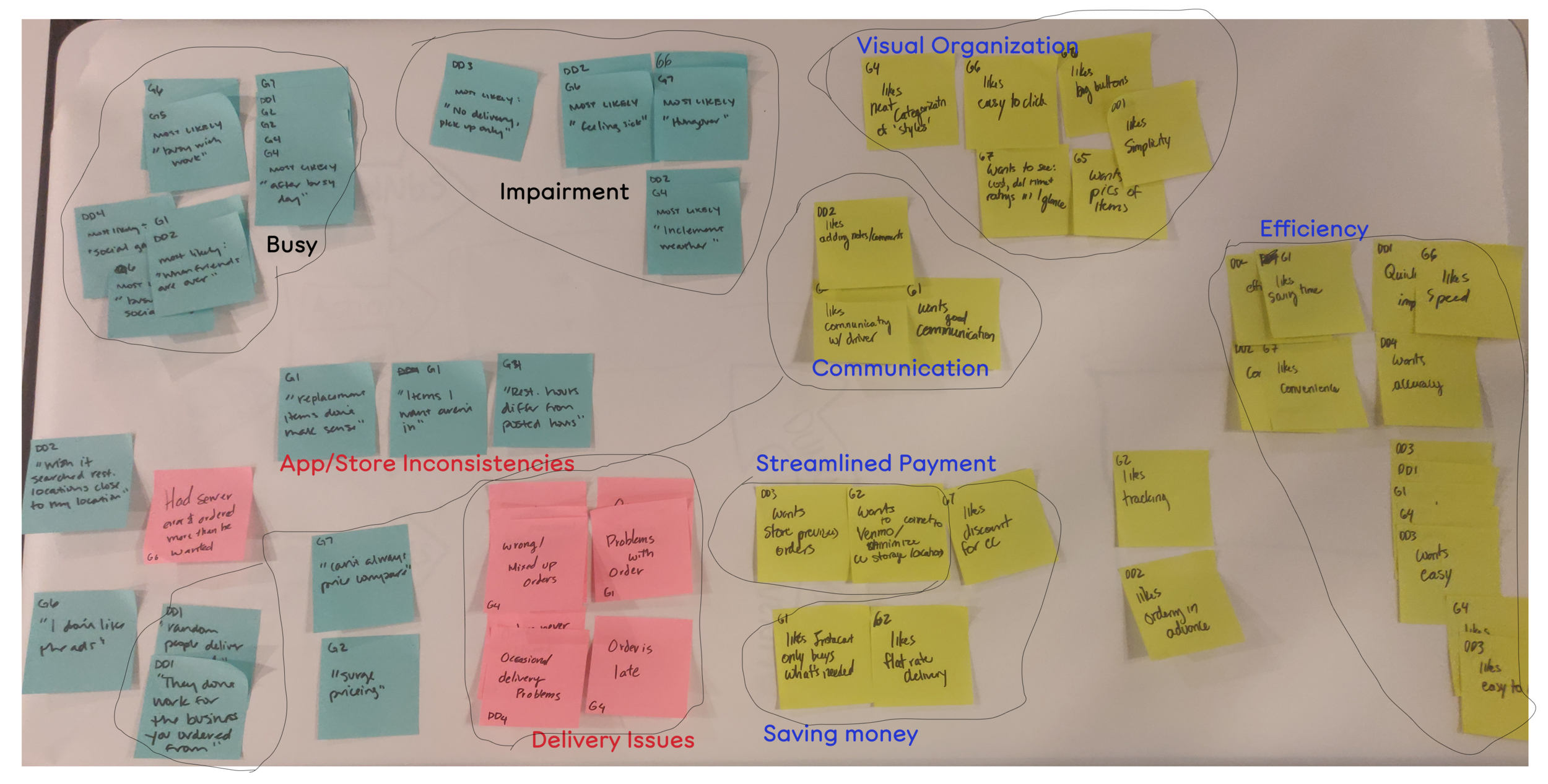
Firmly grounded in our market research, we conducted user interviews to get to know our users better. Since 90% of Dunkin's market is in the Northeast, the lead researcher scouted four customers from that region.
We affinity mapped this data and discovered:
- Customers were most likely to use delivery apps if they were impaired physically or environmentally (by weather).
- Efficiency was one of the top desires
- Direct communication was another

Personas
Order Tracking
I used our interviews to generate two distinct personas with different needs. Our first user, Kathy, wants to place orders for her whole crew. Our second user, Henry, wants a way for his coworkers to add to his order.
JOURNEY MAPPING
Simplifying Delivery
We created a user journey depicting Kathy's current experience delivering coffee herself and her future experience using our app. Most of her pain points revolved around interactions that could be eliminated with a streamlined app.

Competitive Analysis
The Most Direct Route
We surveyed third-party delivery apps as well as in-house delivery apps. We drew heavily on the UberEats delivery status feature, DoorDash design and Pappa John's
.
Key Features
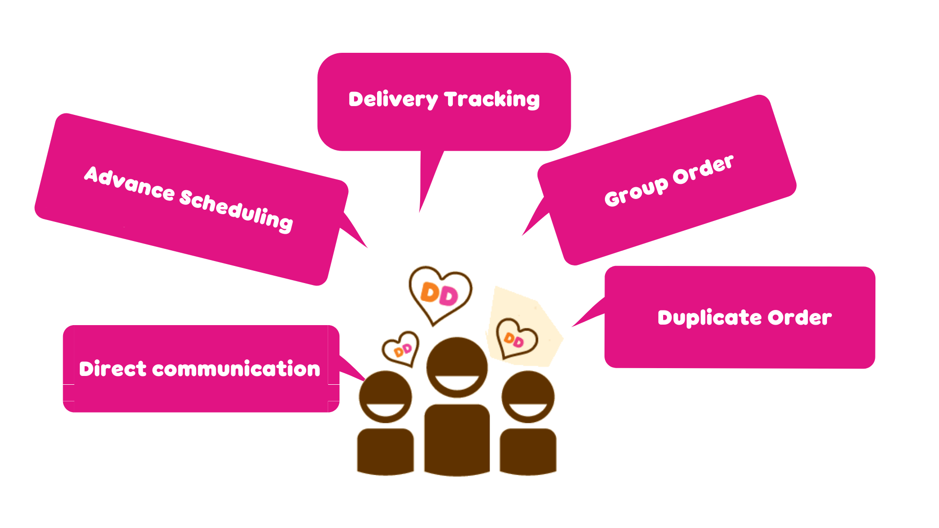
Design Studio
A New Approach
To get the ball rolling on our design, we began with rapid fire ideation. Together with another teammate, in short timed periods of 15 min, I generated a series of screen ideas with the user and market research in mind, pitched them and iterated them.
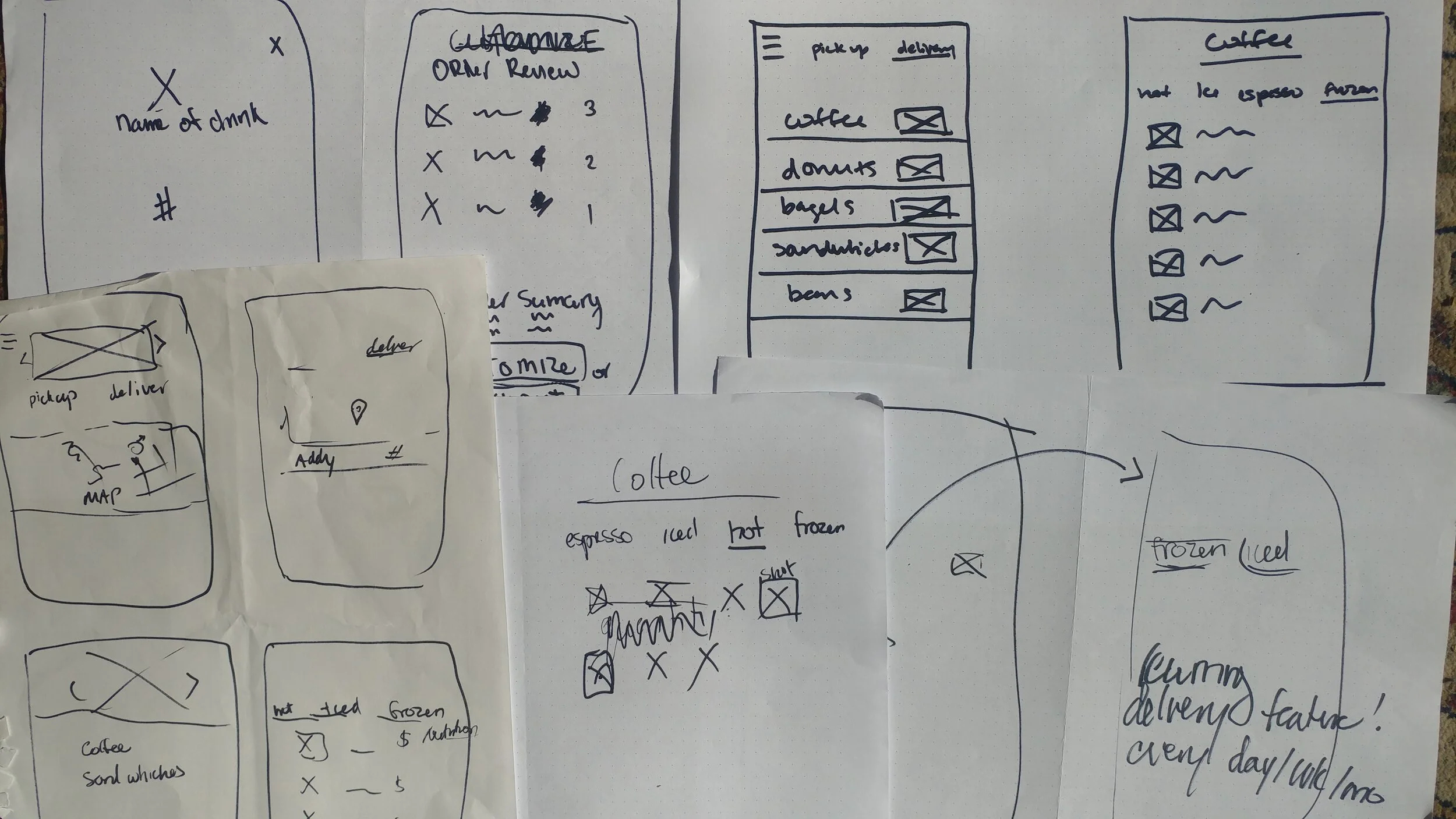

Usability Testing
Back to Basics
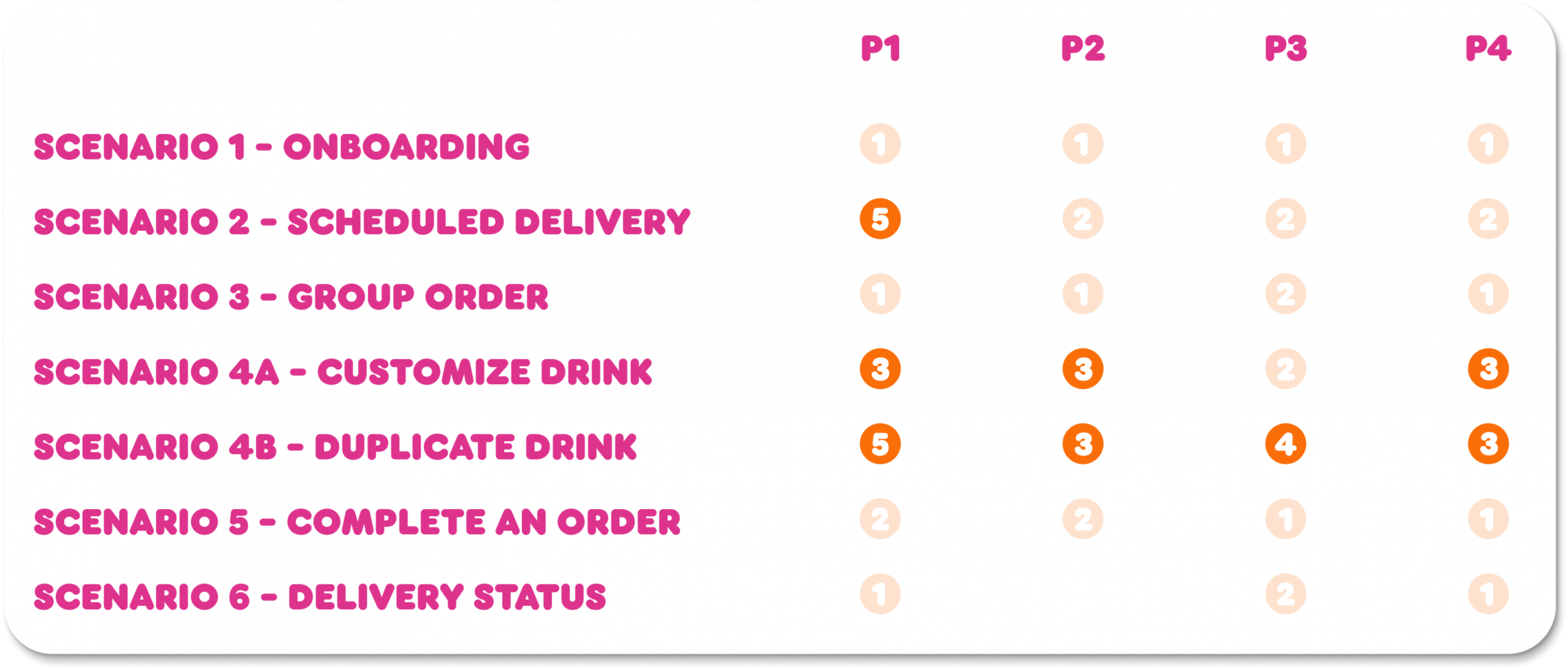
We devised a series of five scenarios with which to usability test. We tested with four different users and recorded their behavior and input. There were elements of our design that didn't change at all or changed very little because the users had a very easy time navigating them. However, there were elements that changed drastically due to feedback. The design section below details the way our user feedback shifted our designs.
HOME SCREEN
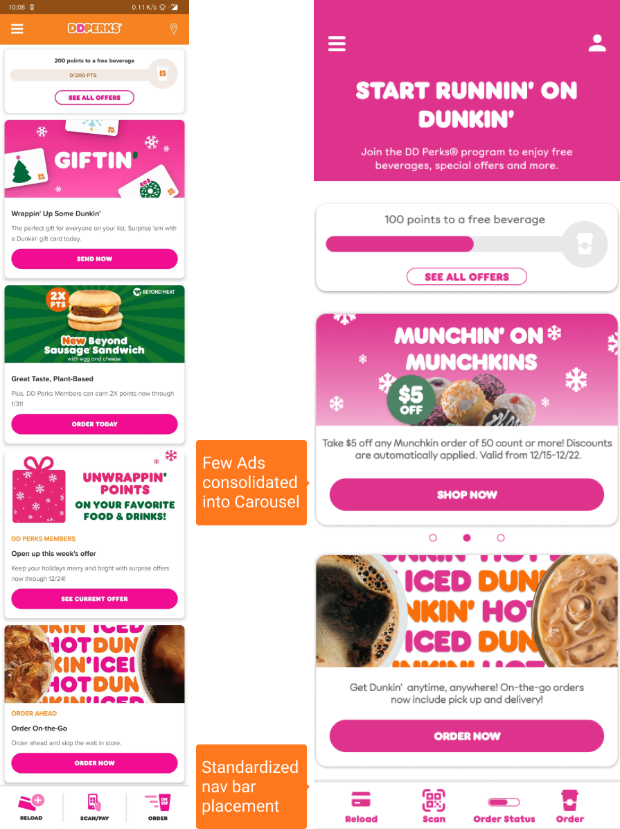
Home, Short Sweet Home
We made only minor changes to the home screen. The current Dunkin' app has the navigation bar at the bottom for signed-in users but positions it up top for guests. We moved the bar to the bottom in either mode so the bar would remain consistent.
We also removed some of the ads so that users would not need to scroll as much to reach the end of the screen. Instead, we added carousel display to the ad blocks we did keep.

Delivery Preferences
When & Where?
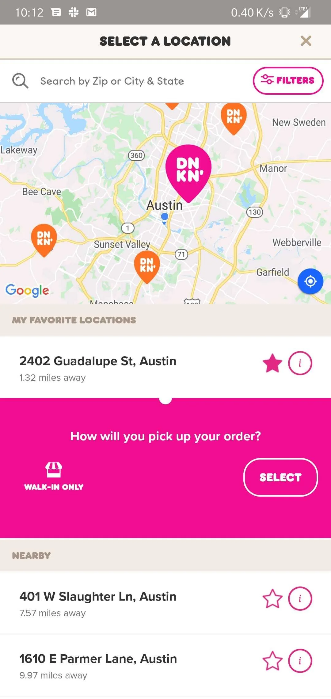
Because Dunkin' is a franchise, their menu changes according to location so it was important that users select their location prior to selecting their products on the menu. This was also a consideration because our user interviews revealed that a mismatch between what they order and what is in stock. Some users missed the delivery option so we emphasized it with color in our high fidelity frame.
MENU
What You See is What You Can Get.
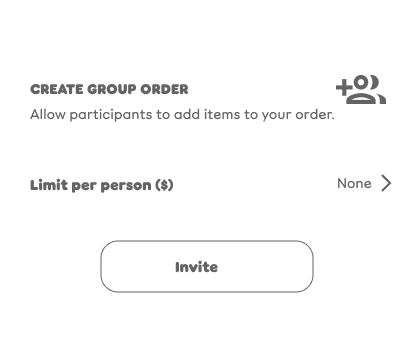
We introduced the group order feature at the top of the page as a single button.
We included the store location so that users were aware they were selecting from that store's menu.
I implemented a tab bar that included favorites and recent orders alongside the menu.
We moved from list to icon view to minimize the scrolling length.

Our first iteration (above) of the group order was a pop-up that opened after clicking on the icon. Our second iteration represented a fundamental change in approach.
Ordering
Two Ways to Group Order
Our first iteration (above) of the group order was a pop-up that opened after clicking on the icon. Our second iteration represented a fundamental change in approach.
Our second iteration represented a fundamental change in approach. We identified two core user flows: Kathy ordering for her whole office and crew, and Henry inviting his coworkers to add their orders to his own.
The bottom buttons now reflect these two these two options to "order for group" or "invite others".
We also felt that it was important to continue to educate the users on the new feature and so we included instructions on the pop-up.
We amended the limit per person to be a toggle button to extend the vernacular we established on the menu pages.
PARTIAL DUPLICATION
Duplicate Parts
What if three members of Kathy's crew want a cappuccino but Bill wants a large, Amy skim milk and Cedrick a flavor shot?
In anticipation of these large group orders, I proposed a duplication feature with customization differentiation.
Kathy could choose different customizations for each drink before adding it to her bag. That way, she wouldn't have to go back to the drink menu to select cappuccino 3 different times.
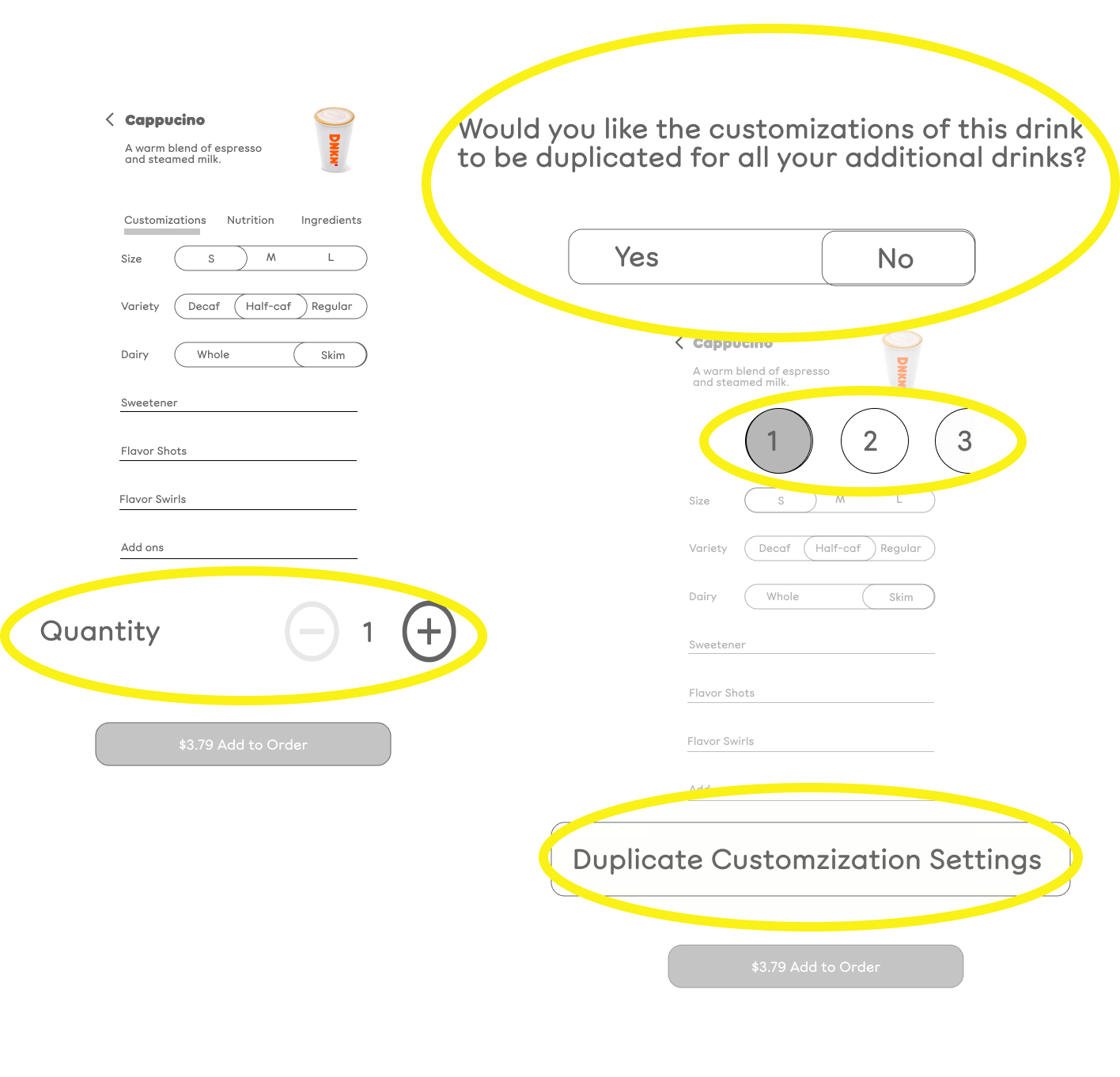
1. User selects quantity of items.
2. pop-up asks whether the user wants to make each drink identical. The goal was to have users customize each item differently but this was not clear to users. As one user said, "If I'm duplicating the drink, why would I need to customize it?" Because of current conventions, users all understood selecting any quantity above 1 to be a duplication of the specifications they had just set. Thus, none of the following screens made sense.
3. The confusion increased because none of the users read the numerals at the top of the subsequent screen to refer to the drink number.
4. Finally, the positioning of the 'duplicate' button (fig. 4) caused users to overlook it. The idea behind that button was that if some, but not each of the drinks in a set were identical, they wouldn't need to be manually entered.

ITEM CUSTOMIZATION
Picking Up What You're Dropping Down

Interactive Nutrition Information
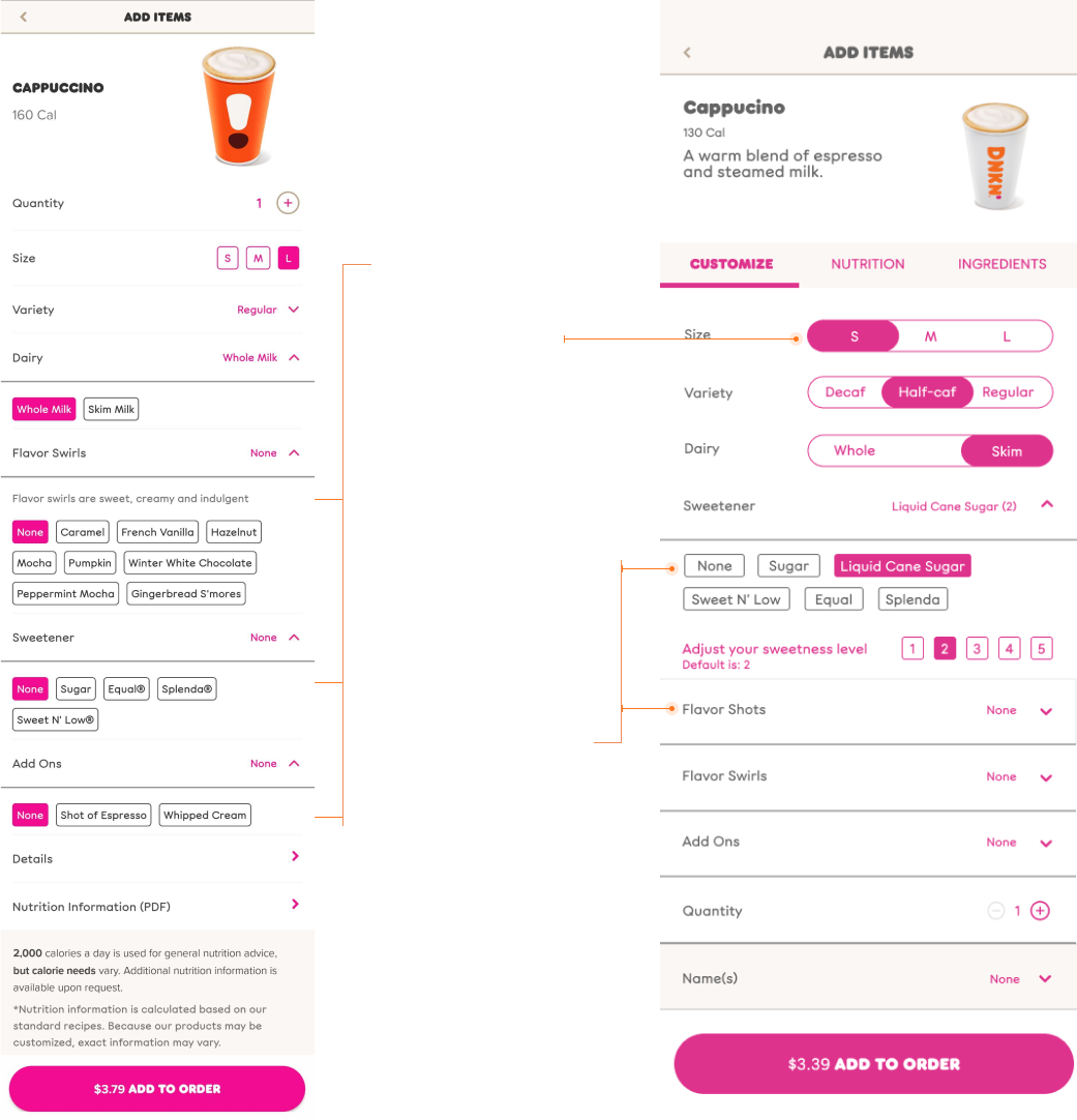
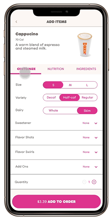
Though it was not on our original feature list, we designed an interactive nutrition page. The current Dunkin' app only offers a 55 page pdf with nutrition information that does not change and opens to the beginning of the document regardless of item ordered. Our new item pages integrated nutrition and reflect any changes in that information based on customization selections.
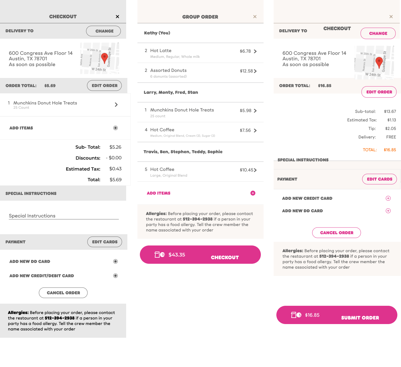
CHECKOUT
In The Bag
Original When we had the duplication feature, all customization occurred within menu pages. For that reason, checkout was one screen containing the order summary and transaction.
High-Fidelity Once the duplication had been scrapped, it was helpful to have the bag screen so that edits could be made to orders prior to checkout. The order summary/ bag and payment transaction screens separated. Group orders can be grouped by name for easy remembrance.

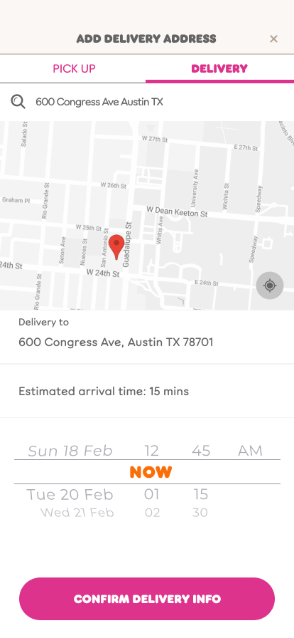
Order Tracking
The We built out the order tracking screen to reflect the status of the order from the moment it is received through delivery. The name of the driver and the driver's contact information is available to meet user demand for direct communication. We also included a rating system and the ability to add any final orders to favorites for easy re-ordering at a later time.