Kira Matica
Room_Service_web_logo.png

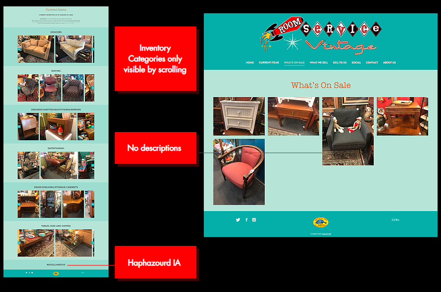
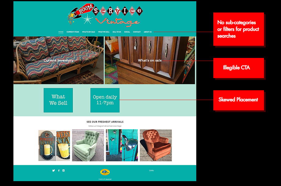
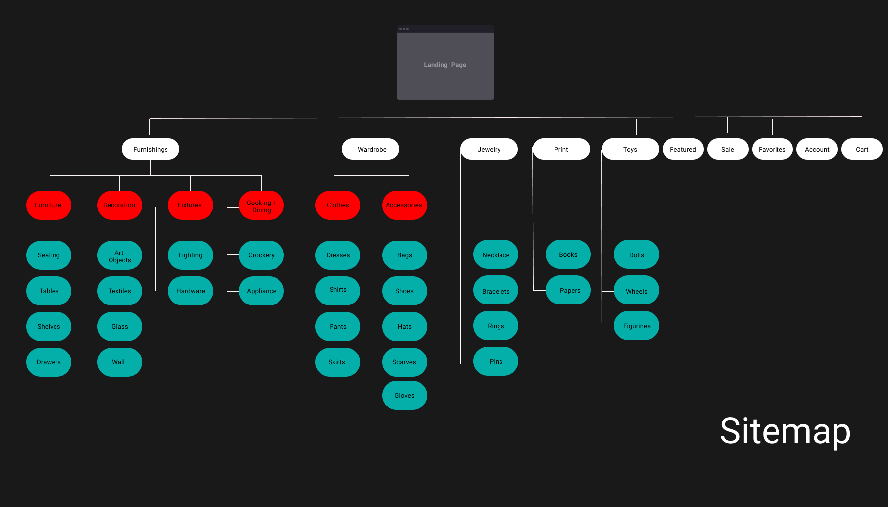
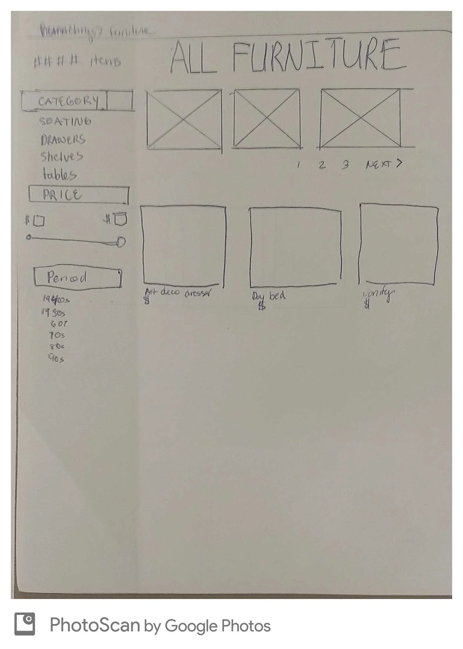
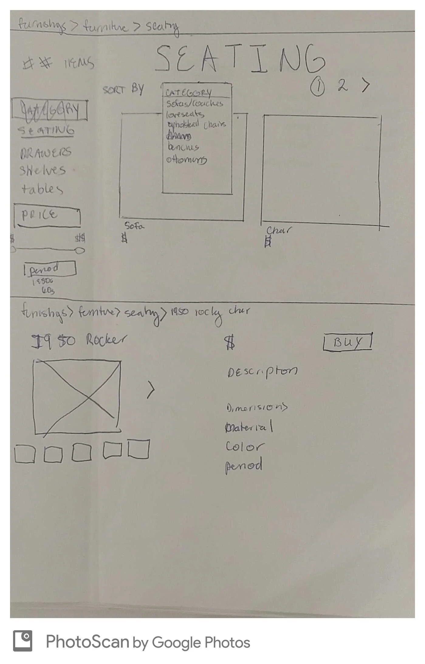
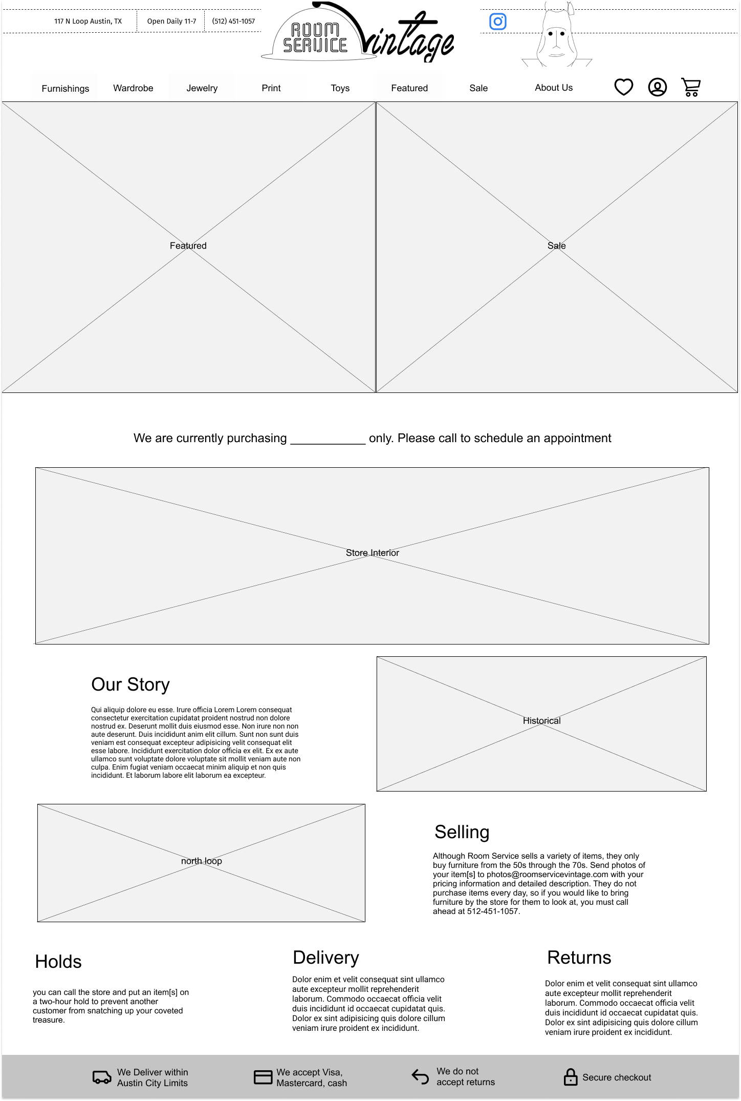
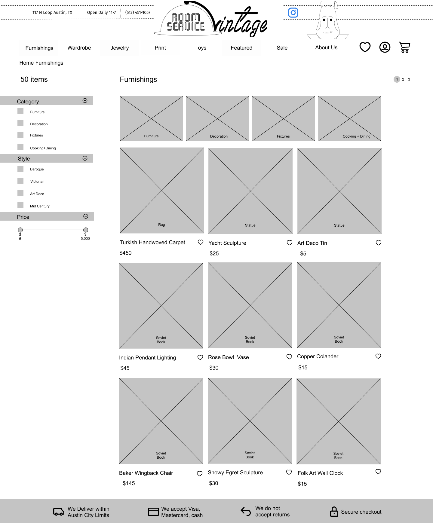
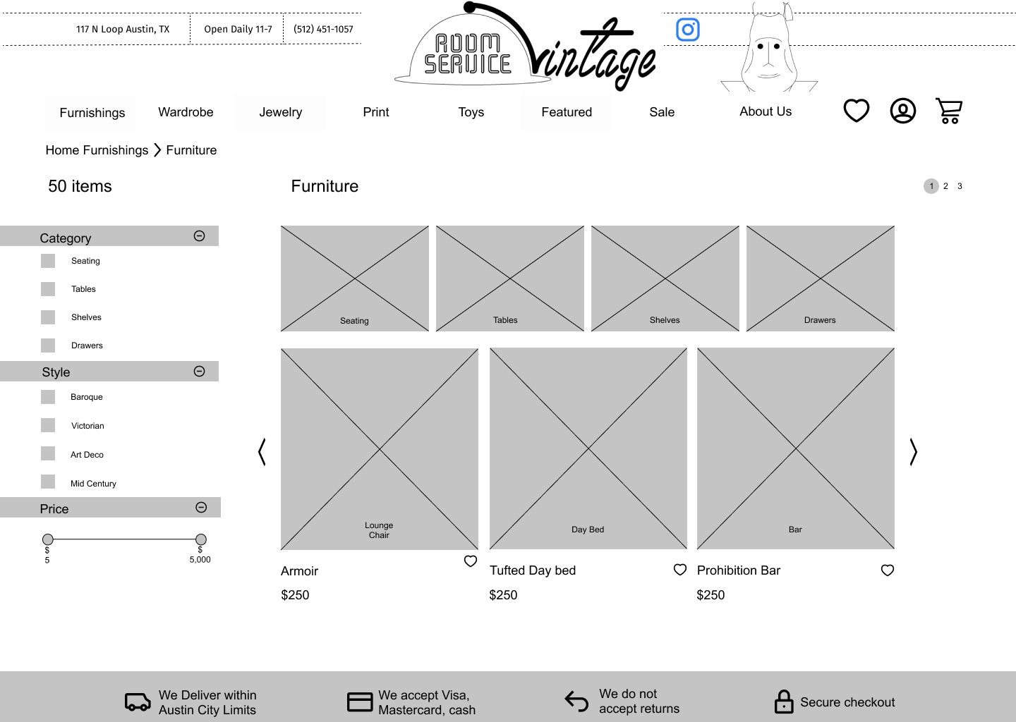
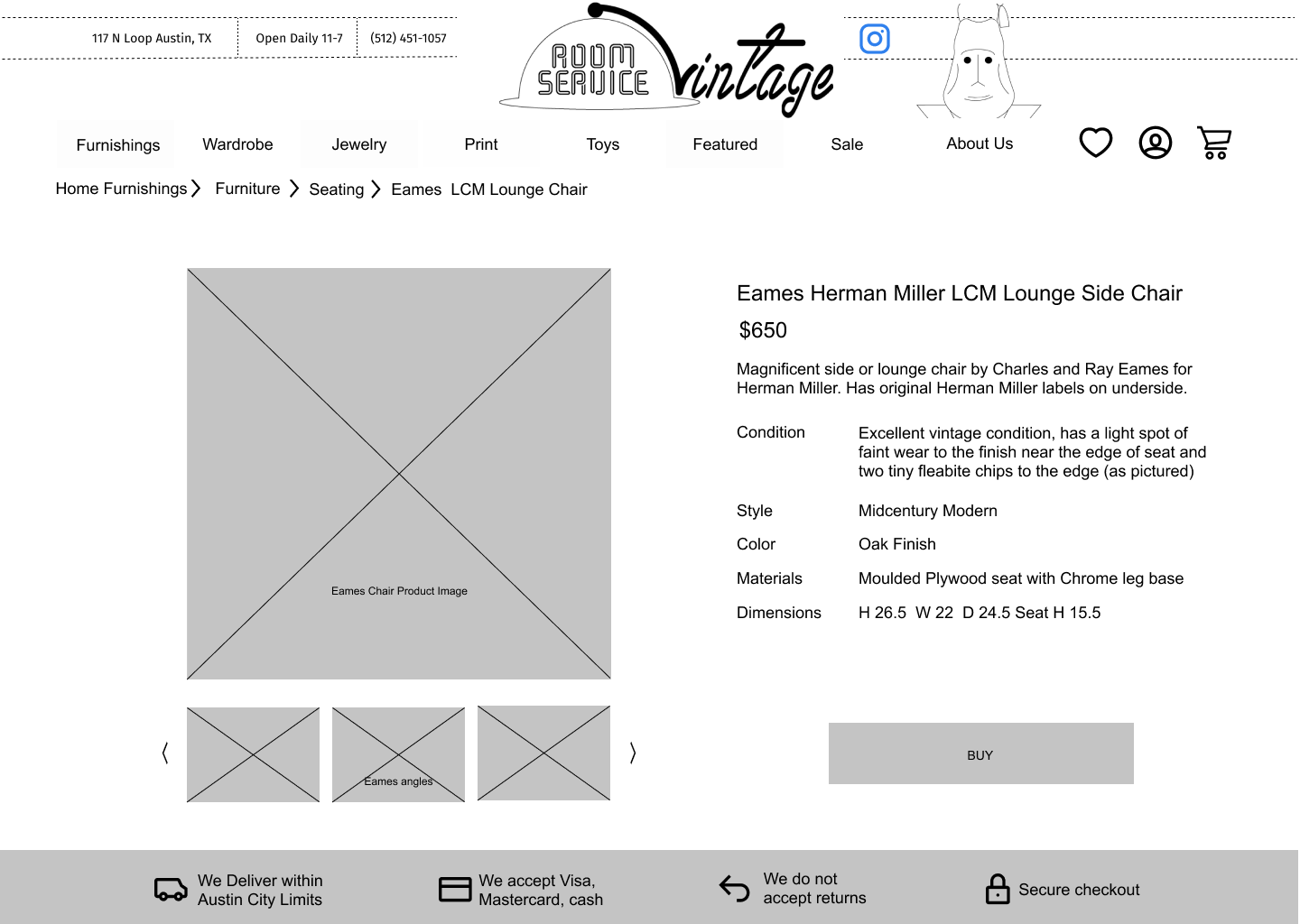
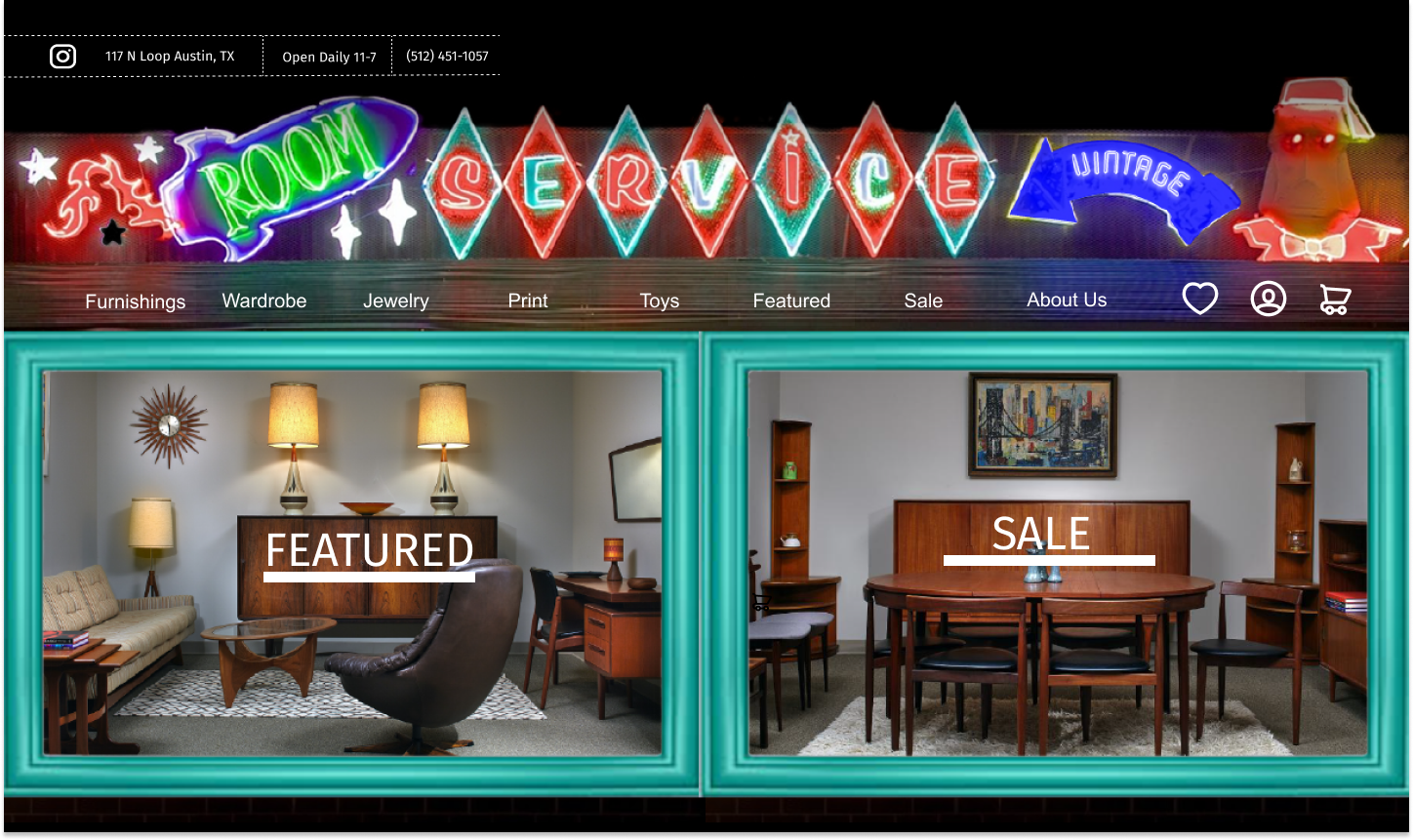
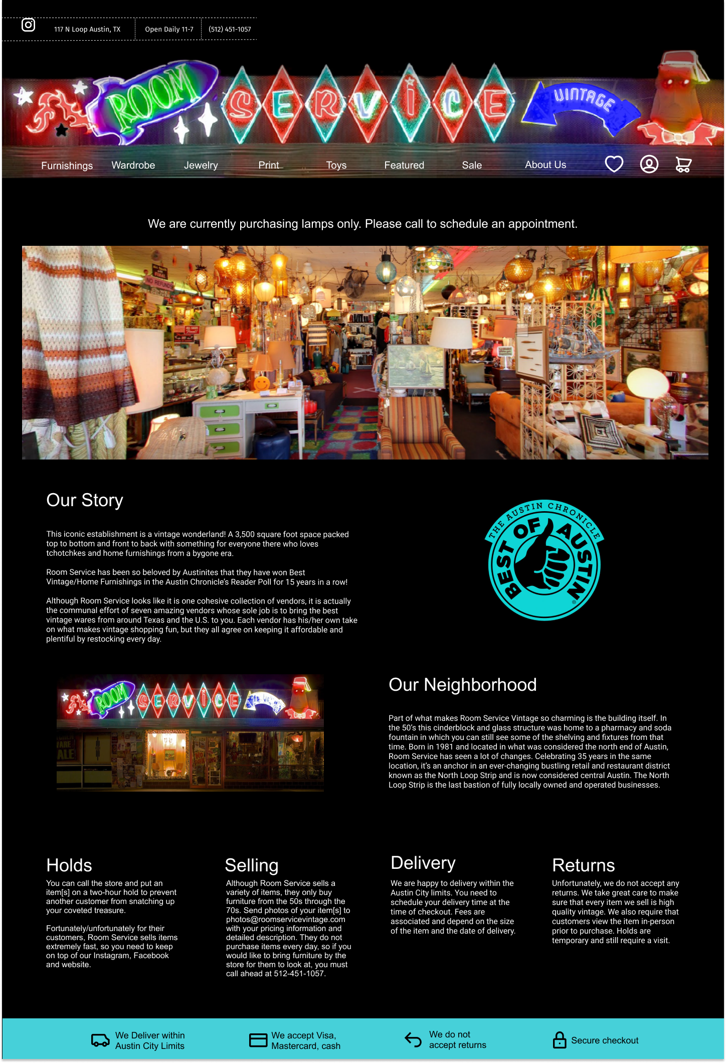
Room Service Vintage is an Austin landmark. The store has been present in the same location since 1981. Like many Mom n Pop stores, its website could use an update. For this concept project, I worked to create an e-commerce feature for the store's website.


teal.jpg

Project Scope + Role

For this one week sprint, I worked alone to update a brick and mortar store's website.


Evaluation

The existing website offers few of the conventions of contemporary conventions of online stores and none of the tools available on e-commerce sites.

 
annotated other pages rsv.png
annotated main page rsv.png
black.jpg

 Market Research

data chart.png
ecommerce data chart-01.png

(left) For this very quick sprint, I researched demographics to get a clear picture of the type of user for whom I was designing. I used this information to create a proto-persona.

(Above) Online retail has been expanding at a dizzying rate yet there is still plenty of room for stores to get into the market. Many do not even recognize the growth potential. 


Mel

Is a social media manager living in Austin, TX. She recently bought her first home and is decorating it in Mid-Century modern furniture. 

"I want my home to reflect my personality."

Frustration

Phoning store to check stock

Goal

Unique home decor

stcoksy.jpg


lightteal.jpg

Competitive Analysis

I researched leading providers of vintage or midcentury furnishings to identify the aspects of their sites that were most effective. I identified key characteristics to implement in my own re-design.


nj_kaiyo_01.jpg
etsy_Logoupdated.jpg
chairish.jpg
West-Elm-1000px-Square-Logo-400x400.jpg

Multiple search options: search bars, navigation bars and filter menus
Personal Account options: saved user contact information, billing and payment information, and favorites
Thorough descriptions: multiple angles of all products, detailed descriptions of items based on numerous parameters.
Attractive layout: balanced composition and generous photo sizes
Information architecture: complex indexes of a multitude of products
Delivery: the option to have the item delivered.


To make sure that the wide array of uncommon objects sold by the store were categorized in a way that made sense to vistors, I asked four people to complete a card sort of inventory items.

placeholder.png
placeholder.png
black.jpg

Information Architecture

sitemap.png

User Flow

This user flow chart describes two sets of decision paths users can take. 

Site Map

I created a sitemap on the basis of the categories from the card sort.


sketch1.jpg


sketch2.jpg

Sketches

Based on my initial research and sitemap, I made some quick sketches that served as a starting point for design.

 
black.jpg

Low- Fidelity Wireframes

Landing Page (1).png
All Furnishings page.png
furniture page.png
product page.png
 
Android - home.png
Android - product.png
Android - cart.png
Android - access.png


teal.jpg

Usability Testing

I recruited three users to test my initial prototypes. I discovered:
Some users gravitated to one navigation system while others preferred the filters, confirming the usefulness of both
All users clicked on the words rather than nearby carrots to use dropdown so I linked them both to the dropdown action
The icons on the footer led some users to expect action and others not but they were less likely to expect an action with full text beside the icons so I added text. None of the users scrolled down

black.jpg
 

High- Fidelity Wireframes

Landing Page.png
about us.png